Illustrated HR Infographics, Generated From a Brief
Eight HR infographic types — onboarding timelines, benefits grids, team rosters — generated from a plain-English brief as illustrated, on-brand, print-ready PDFs.
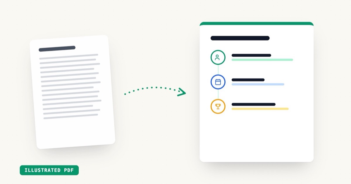
Today we're shipping HR Infographics: eight document types that turn a plain-English brief into an illustrated, on-brand infographic — onboarding timelines, benefits overviews, PTO policies, team rosters, values one-pagers — exported as a print-ready PDF.
Key Takeaways
- 8 HR infographic types: onboarding, benefits, PTO, performance, remote policy, training, team, values
- Illustrated layouts — timeline, grid, hero, roster — picked to match the content
- Deterministic rendering: same brief in, same polished visual out, every time
- About 25 seconds from brief to PDF
- 1 AI generation each, on any plan including pay-as-you-go
The problem with HR documents
Every HR team owns a stack of documents that employees genuinely need to read — and almost none of them get read. The benefits overview is a dense table. The onboarding plan is a bulleted Word doc. The PTO policy is four paragraphs of legalese forwarded in an email thread.
The information is fine. The format is the problem. People read timelines, icons, and short blocks. They skim walls of text.
Designers know this, which is why companies with design teams turn these documents into infographics. Companies without design teams… forward the Word doc.
What got shipped
Eight types, each tuned to its job:
| Type | Default layout | What it's for |
|---|---|---|
| Onboarding | Timeline | First day → first quarter, step by step |
| Benefits | Grid | Parallel offerings: health, dental, 401k, perks |
| PTO policy | Grid | Vacation, sick days, holidays, how to request |
| Performance | Timeline | Review cycle: self-review → 1:1 → calibration |
| Remote policy | Timeline | Expectations, hours, equipment, security |
| Training | Timeline | Learning paths and program milestones |
| Team | Roster | Who's who, with roles and structure |
| Values | Grid | Culture and principles, one block each |
You write a brief — company name, the title, the key points — and EZdoc lays it out with illustrated icons, a coherent theme, and your brand colors if you have a brand kit saved.
Why these render differently than our other documents
Most EZdoc documents are designed freeform by the AI — that's what makes a flyer feel like your flyer. Infographics work differently: the AI writes a structured plan (the blocks, the headings, the illustration for each), and a deterministic renderer draws it.
That buys two things HR actually cares about:
- Consistency. Generate the benefits overview for twelve departments and you get twelve documents that look like a family, not twelve interpretations.
- Predictability. The same brief produces the same visual. No surprise layouts the morning of onboarding.
It's also fast — about 25 seconds — because the AI is writing a compact plan, not painting every pixel.
At scale
One infographic is one AI generation. But the real unlock is pairing it with bulk generation: a CSV of teams or departments in, an illustrated infographic per row out. New-hire onboarding packets, per-office benefit sheets, per-team rosters — generated together, branded identically.
Try the first one free — the onboarding infographic generator is the best place to start.